Items: nonpartisan politics
These items are political but largely (but not entirely) nonpartisan.
- High card settles election in a rural Nevada county.
- A finer-grained version of the red state/blue state idea: USA TODAY's red/blue county map. The state lines really stand out here, and they combine with the mosaic/fragmented look of the counties to make it look to me like someone threw a rock at the place where the Ohio River meets the Mississipi and cracks are spreading. (That's not a political or metaphorical comment in any way; just my first reaction to the visual appearance.)
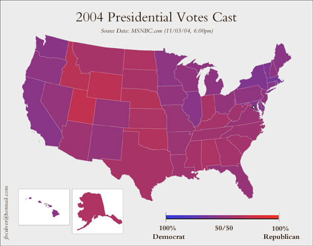
- The purple map shows each state as a mix of red and blue.
- Combined county and purple map. (This one may be kind of muddy in places for people like me who are slightly colorblind.) Later on that page there's another version of the map featuring raised bumps where there are population centers. There's also a large-size version of the non-bumpy one.
- Geomblog features some related cartograms.
- Why and when did red and blue come to have their current political connotations? See "One State, Two State, Red State, Blue State" in the New York Times. (I'm reminded that I recently read that in Victorian times, our modern gendered baby-clothing colors were reversed: pink was for boys, blue for girls.)
- Speaking of maps, a Times of India article says: "A map of the market for pornography that appeared in the New York Times just before the 2000 election bore an eerie resemblance to the eventual electoral map." No idea whether that's an urban legend or not, and no idea just how eerily close the resemblance is, but I thought it was a cute comment.